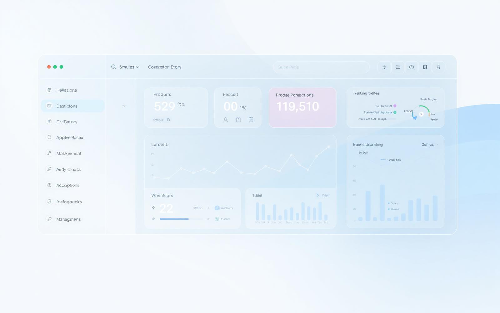
Orbit Ops is an interface system for teams who live inside one tool all day. It explores navigation, density and layering for dashboards that stay readable once real data arrives.
SaaS products grow by addition. Every requirement becomes another panel, and eventually nobody can tell what a screen is for or where a task starts.
The concept asks whether a dense product interface can stay legible using structure, depth and typography instead of more borders and colour.
02
Approach
We wrote the top jobs-to-be-done first, then designed the smallest navigation model that supports them: one primary rail, one working surface, no nested menus.
Every metric on screen had to support a decision. Anything that only described the system moved out of the default view.
03
Design
Three fixed layers — canvas, working surface and floating control — each with one material treatment. Any new component has to pick a layer.
A four-step type scale and a single accent carry the whole interface. Status uses shape and label as well as colour, so it survives colour-vision differences.
04
Development
Prototyped with accessible primitives, so keyboard order, focus states and labelling were correct in the prototype rather than retrofitted later.
Tokens are exported as CSS custom properties, which means the same values drive the design files and the implementation.
05
What we took from it
The layering rules and token set from this concept now underpin how we approach any product UI engagement.
Self-initiated concept. No usage data, adoption or efficiency numbers are implied.
Concept project — imagery created for this study, not client material.